Travel & Leisure
IX DESIGN & INFORMATION ARCHITECTURE PROJECT
Project Brief
Travel and Leisure is a site designed to facilitate the entire process of planning and booking a trip, and more specifically, to assist those who know that they want to travel but may be unsure about where to go and what to do. Users can find inspiration from a variety of features including “popular destinations,” “honeymoon spots,” and “resort recommendations.” Once they’ve decided on a destination, and have booked flights and lodging through the site, Travel, and Leisure helps users to plan their trip in greater detail by providing information on local events and activities, restaurants and bars, significant landmarks, sightseeing opportunities, and tours. User-generated reviews and ratings act as a reference guide for the well-informed traveler. Anything of interest can be added to the “Trip Planner” which serves as a customized organizer, schedule, and itinerary for the trip, ensuring that users get the most out of their vacation. Traveling, while an amazing and worthwhile endeavor, can seem a daunting task for the inexperienced traveler. So for guiding and easing the minds of these users, the site includes a plethora of travel tips concerning packing, flying, local customs, and most importantly, safety. All of the user’s plans and information are associated with their travel account, which allows them to access their schedule and edit their trip from anywhere around the globe.
My ROLE
Research, Data Analysis, Card Sort, Site map, Wireframes, Organizing Report
timeframe
5 weeks
team
Adam Obringer
Alex Stroud
Aeriel Robinson
Overview of the DESIGN PROCESS
We began by looking for websites in dire need of a UX redesign; we found a website called Travel and Leisure. This website was very unorganized and more of a mood-board of travel than an organized and functional site. There was very little organization, just a random melange of articles, trip suggestions, and reviews splattered across the page. After determining our inspiration, we individually extracted the most important categories and aspects of the site and presented them to the group. We had so many great points, but needed to reduce those down to a workable amount- so we took a vote to identify the 30 most critical attributes. Once we narrowed our scope, we converted the 30 characteristics to cards in Optimal Workshop. We recruited participants that travel at least once a year to complete our card sort, and over the next few days received a bounty of information. After the card sort, we each interpreted the information we’d collected and chosen a “path” to wireframe as in one complete use case. Now that we’d converted all of that data into useful website structure, we consolidated our work to paint the whole picture of our proposed site. We then divided the tasks of creating a final wireframe, final sitemap, presentation, and report across the group.
Card sort Analysis
After our group conducted our card sort, we analyzed the data and found out that our participants had chosen to categorize their cards in similar groups. We then took the same groups and used them to design our sitemaps. The feedback we got from the card sort was not what we expected, but we did our best with the results we got back. We decided to choose a task for each team member and design its sitemap and wireframes for each of them.


Final Sitemap

Christopher Edwards
Sitemap: Book a Flight
My task for the project is to book a flight and below is my redesigned path for the Travel and Leisure website. The Travel and Leisure website has a complicated way of booking flights, so my goal is to design a much simpler way for the user to complete this task.

wireframes

Image One
The user will log in to the site and then select the Flights & Hotels category; then they will choose the flights link, that will take them to the pop-up page called Search Flights. Using the search for Flights page, the user will be able to select from the flight option buttons; flight only, flight and car, or flight, hotel and car. Also, the user will be able to choose from a list of radio buttons with the labels; roundtrip, one-way, and multiple destinations. Users will be able to use dropdowns labeled From and To, to choose what city or airport to Depart from and Return from. They will be able to type in the date of departure, date of return in a text box or use the calendar icon to select dates. There will be two dropdown menus, for them to decide how many adults will be traveling and how many children. I added the option of radio buttons for the user to choose to pay with dollars or their points. After their selections are all completed, the user will click the search button, and this will take them to the Select flight page below.

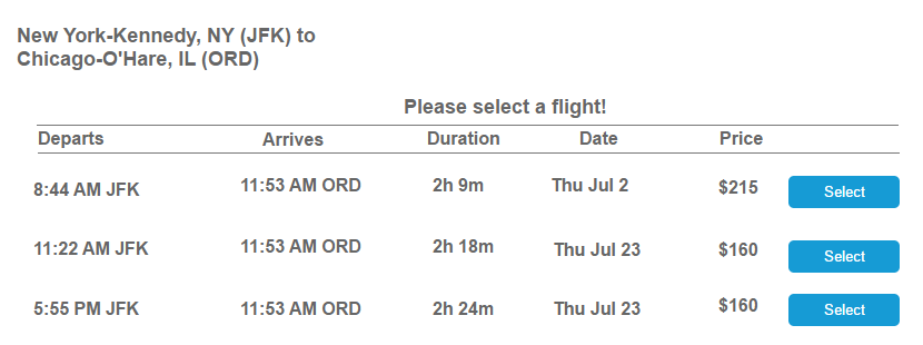
Image Two
Users will be able to choose their flight by viewing the departure and returning list once they are on the select your flight page. They can decide which price is more affordable for them and select it for booking. Once their selections are over, they will be taken to the Review your trip page.
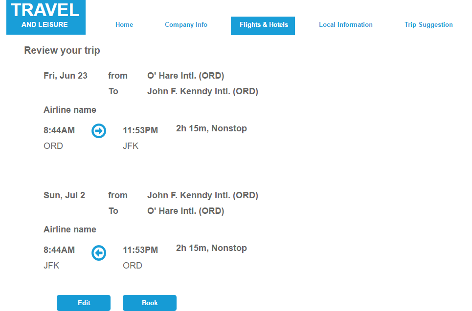
Image ThreeSimilar to the previous page, users can view multiple rooms on one page and not have to open multiple tabs. If users find a place they want, they can go right to the resort website to book the room. If a mistake is made, the user can use the “Go Back” button to return to the previous page
Adam Obringer
Sitemap: Find a Resort and Room for a Honeymoon
The task I took on was selecting a resort and room based on a destination. Going through the stress of booking a honeymoon a few months ago, my primary goal was to give the user options on one page and simplify the process of selecting a spot.

Wireframes

Image One
After selecting “Trip Suggestions” from the main menu and “Honeymoon Spots” from the submenu, users will have an opportunity to search for a destination by the city, state or country. This is to help users who may not know where they want to go on a honeymoon or users who know where they want to go and need to find a resort.

Image Two
After selecting a destination, users can view different resorts on one page and information on each resort. The feature to display information on the same page can alleviate the stress that comes with finding resorts by opening multiple tabs. Once a resort is selected, users can move on and choose a room.

Image Three
Similar to the previous page, users can view multiple rooms on one page and not have to open multiple tabs. If users find a room they want, they can go right to the resort website to book the room. If a mistake was made, the users can use the “Go Back” button to return to the previous page.
Alex Stroud
Sitemap: Trip Planner

As someone who likes to travel and is a bit disorganized, it’s sometimes hard to keep track of my schedule, and I often end up stressed out on vacation, not fully maximizing my precious time on that trip. The Trip Planner is a tool to help users keep track of the trips they’ve arranged through the site. It can be used to plan and view trips across several months, and can also function as a daily itinerary - showing the user their flight/ transportation times and activities scheduled for that day. This feature is linked and associated with a user’s account, meaning that it can automatically record the user’s selected plans and is accessible from any device. It could also utilize notification to alert the user of scheduled items or other noteworthy information.
wirefames

Page 1
The main page consists of a calendar view, showing the trips the user had arranged through the site. The days comprising the duration of the trip are highlighted, and events for each day are shown in the respective cells. The user can select from a list of months, the currently selected month being displayed at the top, or cycle through one month at a time. The user selects Wednesday the 3rd to view their itinerary for that day.

Page 2
This is the itinerary. It shows, in order, every event planned for that day and images associated with that event- could be a picture of the landmark, restaurant, hotel, beach, that the user intends to visit, or could be a pin on the map showing where the activity takes place. I like the idea of a more visual representation of the itinerary, but perhaps a simple list view would be more functional. Next, the user wants to find out more about the Town Market and selects that event.

Page 3
Page 3 shows details about the Town Market where the user plans to head for breakfast. The image for this item is displayed at the top, followed by the location on a map, and to the right historical/ relevant information about the area and possibly user reviews. This page could also have a link to schedule a cab or Uber to travel to the event.
Aeriel Robinson
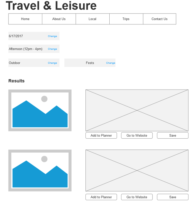
Sitemap: Search for Something to Do
In the task of searching for things to do, the user will be looking for events to partake in. According to my sitemap, this task is located in the Local section of the site. The purpose behind the wording is because part of the site is dedicated to planning trips while some of the other features are for experiencing a location. The purpose of the site is to not only provide ways for users to explore other areas but to showcase festivities in their location. This also works for the trip planning portion because once the users arrive at the destination, they can find local things to do.